Tag Archives: user experience

Five Ways to Address Complexity In Your Product

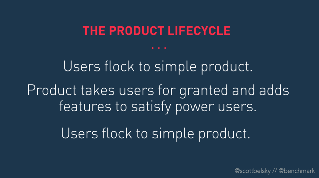
In Crafting The First Mile of Product, Scott Belsky talks about the product lifecycle. In it, Scott states:

  • Users flock to simple product
  • Product takes users for granted and adds more features for power users
  • Users flock to simple product

Now, myself and others have written before about different ways you should attempt to defy this second step. Let’s say you’ve listened. How do you then keep your product simple while trying to grow, capture new audiences, and add new value props? Is the solution to… not do any of that, like a Craigslist? Seems like that doesn’t work too well given all of the companies that have attacked Craigslist from different angles and built bigger businesses than it. Is the solution to ignore Scott’s warning and rely on network effects or some other deep switching costs to retain users? This isn’t a bad idea, and why companies like Facebook continued to grow despite adding more and more complexity over time. During this time though, Facebook users also flocked to Instagram, Snapchat, TikTok, et al. Is the solution to rely on humans to help customers navigate the complexity? Sounds expensive.

This is one of the key challenges we faced at Eventbrite when we radically shifted our strategy in 2020. Eventbrite was historically a 50% sales and 50% self-service business. The optimal outcome for a business like that is a “good enough” user experience with account managers that can make up its flaws. This is a very common strategy for enterprise companies with large margins. The problem for Eventbrite is we weren’t an enterprise company with enterprise margins. We work with small businesses and independent creators. Talking to humans is a bug, not a feature of what to them should be an intuitive user experience. And these SMB’s and independent creators don’t pay us millions of dollars individually to profitably employ armies of human help.

So, as we decided to take a bet on building an intuitive, self-service experience instead of masking user experience issues with human support, we really had to confront Belsky’s product lifecycle for the first time. Eventbrite over the course of the last decade built out a multitude of different features for all different types of event creators, of all shapes and sizes. We did not have a simple product for event creators at all. It had become quite complex.

When people think of simple products, they typically think of consumer products. That is usually where one looks to find the current peak in user experience. There has been a renaissance of user experience and design in B2B use cases over the last decade, but those typically revolve around single use case products, like:

  • Syncing files in Dropbox
  • Sending emails in Mailchimp
  • Setting up a website in Wix or Squarespace

Creating an event on Eventbrite should feel like that; the problem is how vague the definition of event is. Eventbrite has small meetups, large conferences, niche networking events, merchandise drops, music festivals and everything in between. If you can think of it, we’ve ticketed it. There are only a few types of files to sync, emails to send, or website use cases. Our cases were myriad.

So, how do you solve this problem? At Eventbrite we have surveyed a few different approaches I‘ll showcase below as well as what we think works best for our use case. Our initial approach to solve this problem was to just put the creator first. We designed something we called the adaptive creator experience that learned what type of creator you were, what features you valued, and automatically customized the experience for the features you needed front and center. This made for a great vision, but was practically untenable from a data or scale perspective. So what are the practical approaches to solve this problem? Let’s cover each below.

Approach #1: Validate and Unbundle (Temporary Complexity)

When Eventbrite acquired Ticketfly, we originally attempted to separate the experience into something we called Eventbrite Music. There, music specific features wouldn’t complicate the experience for, say, someone doing their first event for ten people. The more we learned about the Music space, the more we learned it wasn’t the features that needed to be radically different, though that sometimes was the case. It was more that the aggregate user experience that music clients, especially more traditional ones, wanted was incompatible with a self-serve user experience. They wanted very detailed interfaces, dedicated training for dedicated employees that only worked on that part of their business. The concept of creating not different features, but different interfaces, felt like a much larger complication to support. Eventbrite now caters toward more modern music creators that share the need for intuitive and self-service experiences. With Eventbrite’s new strategy, we didn’t really see an unbundling approach based on functionality given our two products on the creator side (ticketing and marketing) are already so intertwined in creators’ workflows, and we no longer differentiate creators by vertical as it didn’t map to product needs well.

Facebook was a different story. One thing Facebook did very successfully as it scaled functionality was to prove out the value of features in its core app and then unbundle them into separate apps later on. This keeps their user interfaces, especially on mobile, more focused and easier to navigate. Facebook has now done this with multiple features across Facebook and Instagram. It hasn’t always worked, but that is usually because the product/market fit of the product isn’t always strong enough to survive on its own e.g Facebook Local (failure) vs. Facebook Messenger (success). Uber did the same exact thing with Uber Eats. I have written about this strategy before here.

The pros of this strategy seem pretty obvious. Leverage the scale of the initial product experience to expose people to the new value prop, confirm product/market fit, then move that new product experience elsewhere so the new value prop’s added complexity doesn’t deteriorate product/market fit for the initial product. The issue with this mentality is that once a product is unbundled, it no longer receives as much new user acquisition from the initial product it was built inside of, and sustainable acquisition loops are a key part of product/market fit. Facebook has notably not spun out Facebook Marketplace or Facebook Watch, likely for this reason, and sunset Facebook Local after initially spinning it out. Many app developers tried to launch multiple apps as part of a trend called app constellations, and pretty much all of them failed because user acquisition is really difficult, or they failed to create product value (read more about this here). 

Approach #2: Progressively Disclose (Temporary Simplicity)

One of the key strategies we took at Pinterest to solve the first mile problem was to remove functionality from the initial experience to make sure new users could learn the core concepts. Advanced features like group boards and messaging were not available to new users until we saw that they understood how to save content and access their boards. Once we confirmed the user activated, we started to give them access to the entire product, confident they could handle the increased complexity. This is a form of progressive disclosure to prevent new users from being overwhelmed, but only delays the complexity problem to beyond the activation period. To be clear, this was a very successful strategy for Pinterest, and a dominant approach to new user activation, which is why so many growth teams have dedicated activation or onboarding teams that leverage techniques like this. But it only delays the inevitable complex product in the hope that users are better prepared for it. This is a particularly ineffective strategy when there are more permanent differences between the complexity needs of different users, more common in business use cases like ours at Eventbrite.

The inspiration we were able to take from this approach is progressive disclosure work typically calls into question whether certain features should exist at all. Eventbrite had accrued many features of questionable value because a creator here or there used them. We started aggressively deleting such features in 2020, which helped make the product and code base less complex. We had much success with deleting features entirely at Pinterest as well, and I have written about both feature deletion and successful onboarding in the past. The next phase of leveraging this concept for Eventbrite is radically simplifying our onboarding flow to help creators understand what value we offer before they have to switch their entire business over to it. This is a big investment that will take multiple quarters to get to a great spot, but it is worth it. Still, it doesn’t fully solve Eventbrite’s complexity problem.

Approach #3: Train the User (Hacked Complexity)

Every designer strives for an ultimately intuitive user experience. And I’m sure we’ve all seen that quote that say if a design needs an explanation, it’s a bad design. I often think, has anyone who’s said that quote tried to design software before? This stuff is hard! My preferred saying is a design with education is better than a design that doesn’t educate. Having this aspirational north star of intuitiveness is important for any design team, but it’s okay to admit you’ve fallen short of that lofty goal and leverage other tools to set up users to be successful. Using people and or prompts in the experience to ensure users are successful is not shameful; it’s smart. Eventbrite is in the early stages of leveraging proactive communication and still learning, but we have found that contextual prompts or offering to get on the phone with creators that have demonstrated they intend to use the product at scale can be pretty impactful. People-based strategies do not scale, but they can at least be profitable if they are gated on the value of a customer.

Approach #4: Segment User Experiences (Optional Complexity)

In business use cases, it is less likely that the average user matters, and instead, there are different levels of complexity required for different users. This can be admins vs. normal users or small vs. large accounts to give a couple examples. The more standard approach today to dealing with the very differing needs by user type is to proactively set up user types as part of a complex team-based onboarding, as is common with enterprise products. For products that achieve bottoms-up adoption, this is more likely to be achieved by different packages that segment different types of users. For example, a base package may only have a few features and a low price, and a professional package may have more complex features that would only confuse base users, but are valued by professional users so much that they are willing to pay more than the base package for them. This can be pretty successful when segments are easily identifiable, but when segment needs diverge from clear product delineations, it can create issues. Also, managing separate user experiences by user segment can be hard for engineering and design teams to scale.

Eventbrite launched a more realized package framework in 2017, and found that it failed to map to the different types of creators as elegantly as they initially thought. It turns out features cannot be mapped that easily to different segments just by scale, and that package changes had implications on the entire Eventbrite growth model, not just monetization, since so many creators start initially as ticket buyers in the ecosystem. Segmentation is something that is mapping more neatly to Eventbrite’s marketing tools, which are frequently purchased in a subscription. They work less well for Eventbrite’s ticketing business that deals in transactional costs where features help drive extra sales.

Approach #5: Make Advanced Features Discoverable (Perceived Simplicity)

Segmenting user experiences addresses differing levels of complexity needs when there are easy to identify segments, but what if the same user needs the simple product most of the time, but more powerful features only occasionally? The package based approach will present the user the complicated product every time even though the base product would be a better experience for them most of the time. 

A solution many self-service products attempt is to preserve the simplicity of the core product, but make that additional complexity immediately available on the rare occasion it’s needed. WhatsApp is a great example of this in consumer products. The main interface of WhatsApp is optimized around text-based messaging. It is simple to view chats and reply, and to most users, they need no education to figure out how to do this for the first time. However, WhatsApp actually has a lot more powerful features than this. You can record messages, call people directly via audio or video, leverage emojis, attach images, and take pictures. When you need one of these advanced features, I bet it takes most users less than a second to find them in the interface, but these features don’t crowd the interface for the baseline use case of text messages.

It is very difficult to preserve this level of complexity while preserving a simple interface, and WhatsApp may be the best I’ve seen at it. But it’s important that designers strive for this level of intuitiveness in the face of product evolution, and not retreat to lazier methods that denigrate both the user experience and business performance. Square at one point redesigned their interface to make it a lot simpler, hiding most advanced features behind various settings. The new interface was simple, but users could no longer find a lot of the features they wanted to use, and business metrics suffered. That is not what success looks like. Britelings are probably tired of me using the WhatsApp example, but it is our north star for how we tried to build creator products. Simple for the 99%, surprising and intuitive power for the 1% use cases.

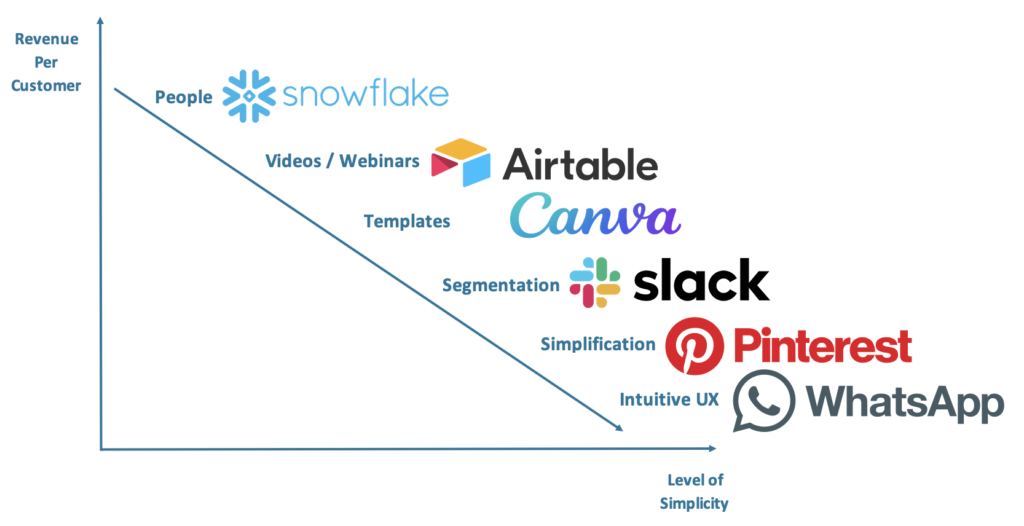
The higher the ARPU, the more you can use direct contact to train users. The lower the ARPU, the more scalable your solution to complexity needs to be.


There is no easy way out of the product lifecycle. Like scaling a culture, it requires a lot of intentionality to scale a product without losing the simplicity that drove so many people to it in the first place. At Eventbrite, we continually strive to make our user experience powerful, yet simple, and we frequently fail to achieve our own expectations. Hopefully, the approaches above help give you some options to manage complexity in the user experiences you own to improve the value for your customers.

Currently listening to my Uptempo Instrumental Hip-Hop playlist.
Podcast with Lenny Rachitsky

Lenny Rachitsky recently launched Lenny’s Podcast, and I was happy to be a guest. We talk about how to communicate upward, different product design strategies for complex products, what it means to be a product leader, and much more. I’ll expand on some of these in upcoming posts. You can listen to the podcast here or on Spotify below.

Currently listening to my Downtempo House playlist.

How to Justify “Non-Sexy” Product Investments

A common issue leaders in product management, design, or engineering face is justifying investment in the “non-sexy” stuff. What is not sexy can differ by company, but usually the sexy things are new products and few features. Non-sexy things include general user experience improvements, performance, developer velocity, infrastructure, technical debt, and, fortunately less than it used to be, growth. I’ll walk through some frameworks and examples from my career on how to drive excitement and investment in these critical areas that may not be properly valued or staffed currently in your organization. But I urge everyone I can in product to develop the intuition to support these initiatives without making teams jump through hoops to justify these investments.

User Experience

The most common path product teams are on today is that they go from feature to feature trying to add new functionality, never confirming their feature actually adds value, and never improving features over time or updating experiences to be more modern as the world evolves. Designers complain about how stale certain experiences get over time, but improvements never make the roadmap. Product managers think designers are whining about things that aren’t important versus their current OKRs. 

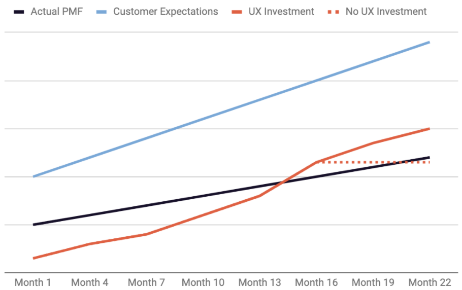
Why are the designers right in this instance? Well, they aren’t always. It is possible to over-design and do things that feel good and look excellent, but don’t materially help your customers or the business. Polishing too often can be just as bad polishing too little as you don’t deliver enough new value for customers. While over-polish does happen, why designers are mostly right is they intuit something about product/market fit that is hard to measure on a metrics dashboard: that expectations of customers increase over time. Another way to say that is product/market fit has a positive slope. If you do not consistently improve your product or feature, and customer expectations continue to increase, your product or feature can fall out of product/market fit over time. Many business strategists talk about companies being in a Red Queen effect with their competitors. This means they have to run really hard to stay in the same place competitively over time. But what many product teams misunderstand is that they are in a Red Queen effect with their customers to maintain product/market fit as well. Consistently improving the user experience helps products stay above that positive sloping curve of product/market fit. Let’s visualize this by borrowing a graphic from my product/market fit essay.


In the above graphic, the customer expectations line is the point at which customers stop complaining about elements of a product. That is not the target for product/market fit. The target for product/market fit is the purple line where customers stop leaving a product. Teams invest in products and features to get them above the purple line, but failing to continue to invest in them beyond that point means expectations for product/market fit will eventually exceed what has been built without continued investment. 

The dotted line is a worst case scenario as it happens in a way that is not measurable, but once those hard to define lines cross, every metric gets worse. So, in prioritizing user experience improvements that scale with customer expectations, the net effect you see is no impact in business metrics. But the effect of not doing these investments means business metrics will decrease over time. This practically means that teams that make investments feel like the investment didn’t “pay off”, but in reality it prevents the possibility of dramatic issues for the product down the line.

On the growth team at Pinterest, Kaisha Hom and Lindsay Norman on the growth design team intuited this, but had trouble convincing a very metric-oriented team on the value of this investment. Eventually, we decided that one of our key results would be a quarterly audit (and refresh if needed) of our top five user flows. The expectation was no material impact on growth, but instead prevented potential growth issues down the road. 

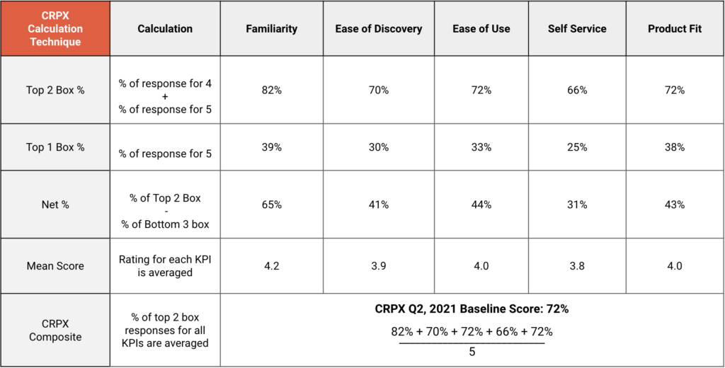
At Eventbrite, we have gotten a little more sophisticated in how we manage this. Adele Maynes, who leads our research team, helped craft a survey that measured different components of our product/market fit, including:

  • Ease of discovery
  • Ease of use
  • Ability to self-serve
  • Product fit
  • Likelihood to recommend

We also created this survey for some of our key features inside the product so we can understand their feature/product fit better. Our new strategy is to be a fantastic self-service experience that rivals the best SMB tools on the market, but we know we have a long way to go to get there. Investing in user experience is a key driver of this strategy, and these scores help us know if our overall product and specific features are on the right track. CRPX is now one of the top level key results for the product team.

Sample analysis of Eventbrite’s Creator Product Experience Score (CRPX)

Performance

Performance, roughly meaning how long it takes for software products to become usable to customers who load them, tends to become a problem at scale without concrete investment. Products become bloated, the number of different types of users and use cases multiply across countries and categories, and the number of frameworks engineers are leveraging to deliver experiences rises exponentially. We actually have pretty good data externally on the impact of performance. There are many studies that show additional milliseconds of load time impact things like conversion to purchase and engagement on many websites and apps. 

A big problem is actually addressing performance issues at the start tends to be measuring it well, across different pages, apps, countries, use cases, etc. Obviously, this is normally the place to start. But sometimes even shockingly high metrics in certain countries or at the edges can’t motivate teams to scrap their current OKRs for performance work. 

On the growth team at Pinterest, we were struggling with some performance issues of our home grown frontend framework. After trying to rally the company around this work and failing, we decided to leverage our skills to prove out the value of this work. A small team of engineers led by Sam Meder decided to work part-time on a performance initiative just for our logged out experiences, migrating to React, server side rendering, lazy loading, spriting – all the usual suspects from a frontend performance perspective. They ran these changes as AB tests to show the impact on user engagement and key business metrics. The result was a 30% decrease in user-perceived wait time, which resulted in double digit= increases in traffic from Google and conversion rate to signup. The impact was enough to get our CEO to push this as an organization-wide initiative the following quarter.

Developer Velocity

Shortly after I joined Eventbrite, I ran into Omar Seyal on the street. Omar was the Head of Core Product at Pinterest at the time. As I said hello and asked him how things were going, Omar, always to the point, remarked, “Pinterest doesn’t understand leverage!”. He then went on to say how he was struggling to get Pinterest to invest in its infrastructure so that engineers could move faster. In my head, I thought, he doesn’t know how good he has it compared to Eventbrite. Startups, or companies that emerge from startups, tend to prioritize new customer value and growth at all costs. This not only can create a lot of technical and design debt that will slow companies down for years to come, but it also prevents them from seeing “what got you here won’t get you there.” At a certain point in a startup’s lifecycle, it has to shift from growth at all costs to balancing growth and long-term scalability. Yes, you could spend 90% of your time building new things when you were small, but that won’t work when you’re big and have dozens of things to maintain. 

A belief Omar and I share is that developer velocity is the purest form of leverage in a software company. So, it follows, investments in things that make developers more productive are the highest leverage investments a company can make. Sure, those investments don’t translate into customer value directly, but they enable each developer to build more customer value. That can mean more features, more experiments for a growth team, whatever the company needs to maximize long term growth. The key question I think non-developers fear is that these are just quality of life investments and don’t actually meaningfully improve the amount of value to customers. After all, you’re spending less resources on value to customers in the short-term whenever you look inward at internal tools.

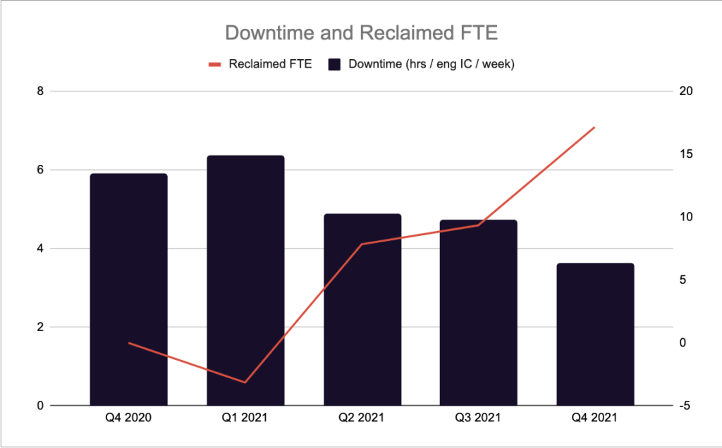
What we did at Eventbrite to confront this narrative is we built a measurement plan and a goal. First, we measured the amount of downtime our developers experience on a quarterly basis for various issues. We then stated that with investment we could decrease that downtime, freeing up more capacity to build value for customers. We then set a goal. By making these investments, James Reichardt and Dan Peterson, our leaders in platform engineering and product, argued we could free up the equivalent of 15 new engineers’ worth of capacity at the company. In the end, those investments freed up 18 engineers’ worth of capacity. We confirmed this with “end of sprint” reporting on different teams on the amount of what they were able to deliver. If those numbers aren’t improving over time, you’re probably under-investing in projects related to developer velocity.

Developer Downtime

Engineering downtime was actually trending upward, but by working on our tooling we were able to save hours per engineer per week.

Growth

As much as I’ve written about the rise of growth teams and how growth teams work, the concept of investing in things that help connect customers to value instead of building new value is still pretty nascent in the software world. I speak to product managers and leaders all the time that are struggling to get investment in areas that could help inflect their growth. We definitely faced some of these same issues when I started at Pinterest. While we had a dedicated growth team, many parts of our growth model felt under-optimized, but also hard to measure or justify investment for.

One of these areas was search engine optimization. A few months before I got to Pinterest, Pinterest had “no indexed” the entire site, leading Google to email us to confirm that was what we wanted (it wasn’t). Anna Majkowska jumped onto the problem, but was only able to secure a few part-time engineers to help her. I joined shortly after as the PM, and we worked together on a plan to improve SEO for Pinterest as we believed that to be a large growth opportunity. The problem was we were on a growth team that ran every change as an AB test to show the improvement in growth. With SEO, you can’t run AB tests because it’s one Googlebot instead of millions of separate users. Julie Trier, a part-time engineer on the team at the time, said we had to develop an SEO experiment framework like we use for other parts of the growth team, and set out to build it. With this initial version, instead of showing different users different experiences, we changed parts of the experiences on some pages and not on others and measured the traffic change from SEO. The framework worked, and helped us justify SEO investments by showing how much extra traffic we received from making changes. 

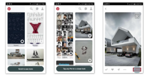
More traffic was great, but the issue was that users from Google would just look at all our cool content and leave. Conversion rates were very low. Conversion was managed by another team. So I went to them and explained the opportunity. They said they were busy working on a home page overhaul and couldn’t look at it. So I said we’ll take on the work ourselves. By then Jean Yang had joined the SEO team and ran an experiment that increased traffic, but decreased sign ups. How that was possible was by making a new page available to Google, we removed a signup modal blocking logged out users from accessing it. It turns out people signed up when they saw that modal, so we hypothesized maybe we could trigger that modal when you clicked on an image when you didn’t have an account. Also, we thought the other thing that indicates you like what you’re seeing and should sign up besides a click on an image is scrolling down and viewing more images. We already restricted Google from seeing more than 25 images on a page, so we decided to make the same change with users, with a modal coming up from the bottom saying to sign up to see more. 

It took Jean two days to implement the experiment, and the result was a 50% increase in conversion rate to sign up. Every graph at the company kinked up as a result. I got a message from Tim Kendall, our Head of Product, asking “What did you do??”. I thought he might fire me, but instead he used the data to go raise more money at a higher valuation showing investors we could inflect our growth. Don’t under-estimate the power of proving it by going rogue or making the measurement investment others think isn’t worth it. It can turn subjective conversations into objective ones very quickly. The team grew dramatically after this with Julie eventually leading a platform team for growth tools.


These are just a few examples of how teams were able to make the investment case and prove the value of “non-sexy” projects to make a big impact. Of course, what tactics work for you will depend a lot on your company’s culture, but one thing that will likely mimic these stories is teams working together to make both the case and execute on the investment. Building products is a team sport, and the more cross-functional the support you achieve, the more likely you are to succeed. 

As I relay these types of stories, it’s easy for people to say something to the effect of “sure, that worked at Pinterest or Eventbrite, but it could never work here” without realizing the point of the story is that almost all companies have these types of issues. The question is whether you are willing to put in the work to try to change the narrative to help your company grow. Those that do typically are rewarded and reward their customers in the process.

Currently listening to my Trip-hop playlist on Spotify.

Feature/Product Fit

Through various methods, Silicon Valley has drilled into the minds of entrepreneurs the concept of product/market fit. Marc Andreessen says it’s the only thing that matters, and Brian Balfour has an amazing series of posts that talk about how to find it. But what happens after you find product/market fit? Do you stop working on product? I think most people would argue definitely not. Post-product/market fit, companies have to balance work creating new product value, improving on the current product value, and growing the number of people who experience the current value of the product. While I have written a lot about how to do that third step, and even wrote a post about thinking about new product value, I haven’t written much about how do that second part.

What is Feature/Product Fit?
Every product team tries to make their core product better over time. But sadly, at most companies, the process for this is launching new features and hoping or assuming they are useful to your existing customers. Companies don’t have a great rubric for understanding if that feature is actually valuable for the existing product. This process should be similar to finding product/market fit, but there are some differences. I call this process feature/product fit, and I’ll explain how to find it.

In product/market fit, there are three major components you are searching for. I have written about my process for product/market fit, and Brian Balfour, Shaun Clowes, and I have built an entire course about the retention component. To give a quick recap from my post though, you need:

  • Retention: A portion of your users building a predictable habit around usage of your product
  • Monetization: The ability at some point in the future to monetize that usage
  • Acquisition: The combination of the product’s retention and monetization should create a scalable and profitable acquisition strategy

Feature/Product Fit has a similar process. We’ll call this the Feature/Product Fit Checklist:

  • The feature has to retain users for that specific feature
  • The feature has to have a scalable way to drive its own adoption

Feature/Product Fit has a third requirement that is a bit different: the feature has to improve retention, engagement, and/or monetization for the core product.

This last part can be a bit confusing for product teams to understand. Not only do the products they are building need to be used regularly and attract their own usage to be successful, they also need to make the whole of the product experience better. This is very difficult, which is why most feature launches inside companies are failures. What happens when a feature has retention and adoption, but does not increase retention, engagement, or monetization for the company? This means it is cannibalizing another part of the product. This might be okay. As long as those three components do not decrease, shipping the feature might be the right decision. The most famous example of this is Netflix introducing streaming so early in that technology’s lifecycle, which cannibalized the DVD by mail business, but was more strategic for them long term.

What is a Feature Team’s Job?
You would be surprised how many core product features are shipped when the new feature decreases one of those three areas. How does this happen? It’s very simple. The team working on the feature is motivated by feature usage instead of product usage, so they force everyone to try it. This makes the product experience more complicated and distracts from some of the core product areas that have feature/product fit.

If you own a feature (and I’m not saying it’s the right structure for teams to own features), your job is not to get people to use that feature. Your job is to find out if that feature has feature/product fit. You do this by checking the three components listed above related to feature retention, feature adoption, and core product retention, engagement and monetization. During this process, you also need to determine for which users the feature has feature/product fit (reminder: it’s almost never new users). Some features should only target a small percentage of users e.g. businesses on Facebook or content creators on Pinterest. Then and only then does your job shift to owning usage of that feature. And in many teams, it’s still not your job. The feature then becomes a tool that can be leveraged by the growth team to increase overall product retention, engagement, and monetization.

Mistakes Feature Teams make searching for feature/product fit
Feature teams commonly make mistakes that dissatisfy the third component of feature/product fit at the very beginning of their testing.

  • Mistake #1: Email your entire user base about your new feature
    Your users do not care about your features. They care about the value that you provide to them. You have not proven you provide value with the feature when you email them early on. Feature emails in my career always perform worse than core product emails. This inferior performance affects the value of the email channel for the entire product, which can decrease overall product retention.
  • Mistake #2: Put a banner at the top of the product for all users introducing the new feature
    New features usually target specific types of users, and are therefore not relevant to all users. They are especially irrelevant to new users who are trying to learn the basics about the core product. These banners distract from them, decreasing activation rates. It’s like asking your users if they’re interested in the Boston Marathon when they don’t know how to crawl yet.
  • Mistake #3: Launch with a lot of press about the new feature
    PR for your feature feels great, but it won’t help you find feature/product fit. PR can be a great tool to reach users after you have tested feature/product fit though. It should not happen before you have done experiments that prove feature/product fit. And it will not fix a feature that doesn’t have feature/product fit.

Many features won’t find feature/product fit
Many of the features product teams work on will not find feature/product fit. When this happens, the features need to be deleted. Also, some older features will fall out of feature/product fit. If they cannot be redeemed, they also need to be deleted. If you didn’t measure feature/product fit for older features, go back and do so. If they don’t have it, delete them. Some of our most valuable work at Pinterest was deleting features and code. A couple examples:

    • The Like button (RIP 2016): People did not know how to use this vs. the Save button, leading to confusion and clutter in the product

    • Place Pins (RIP 2015): Pinterest tried to create a special Pin type and board for Pins that were real places. As we iterated on this feature, the UI drifted further and further away from core Pinterest Pins and boards, and never delivered Pinner value

  • Pinner/Board Attribution in the Grid (RIP 2016): Attributing Pins to users and their boards made less sense as the product pivoted from a social network to an interest network, and cluttered the UI and prevented us from showing more content on the screen at the same time

How do I help my feature find Feature/Product Fit?
All features should be launched as experiments that can test for feature/product fit. During this experiment, you want to expose the new feature to just enough people to determine if it can start passing your feature/product fit checklist. For smaller companies, this may mean testing with your entire audience. For a company like Pinterest, this might start with only 1% of users. The audience for these experiments is usually your current user base, but can be done through paid acquisition if you are testing features for a different type of user.

I’ll give you a few tactics that have helped the companies I’ve worked on find feature/product fit over the years. Most good product development starts with a combination of data analysis and user research. User research should be involved at the right times to add the most impact, prevent confirmation bias, and determine what components users are struggling to see the value of. For example, when we launched the Grubhub mobile app, we saw in the data when people used the current location feature, their conversation rate was lower than people who typed in their address. This turned out to be an accuracy problem, so we turned that component until off until we were able to improve its accuracy.

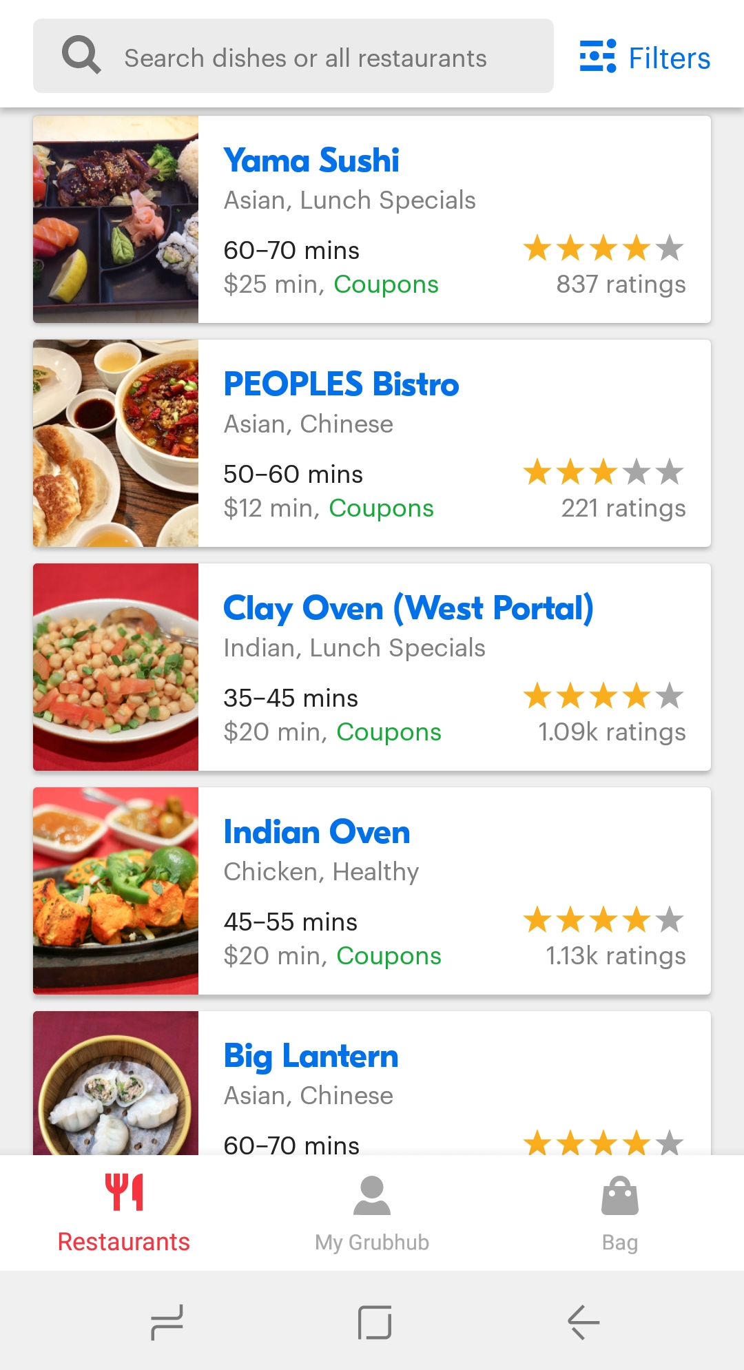
In research, we saw people were having trouble figuring out which restaurants to click on in search results. On the web, they might open up multiple tabs to solve this problem, but this was not possible in the app. So, we determined what information would help them decide which restaurants were right for them, and started adding that information into the search results page. That included cuisine, estimated delivery time, minimum, star rating, number of ratings, On the surface, the page now feels cluttered, but this improved conversion rates and retention.

Since Grubhub is a transactional product, we were able to leverage incentives as a strategy to help find feature/product fit. Our early data showed that people who started to use the mobile app had double the lifetime value of web users. So, we offered $10 off everyone’s first mobile order. This transitioned web users to mobile for the first time and acquired many people on mobile first. The strategy was very successful, and the lifetime value improvements remained the same despite the incentive.

Grubhub also uses people to help find feature/product fit. Since mobile apps were new at the time (and we were the first food delivery app), we monitored any issues on social media, and had our customer service team intervene immediately.


Not all complaints are this entertaining.

At Pinterest, we launched Related Pins in 2013. For Pinterest, we did not have a revenue model at the time, so tactics around incentives and people do not make as much sense. One thing we did instead was use notifications to drive feature/product fit. Once this algorithm was developed, after you Pinned something, we could now email you more Pins you might like that are related to that Pin. These emails were very successful.

Pinterest also used the product to drive feature/product fit. We launched the algorithm results underneath the Pin page to start, and interaction when people scrolled was great. But many people didn’t scroll below the Pin. So, we tried moving them to the right of the Pin, which increased engagement, and we started inserting related Pins of items you saved into the core home feed as well, which increased engagement.

The Feature/Product Fit Checklist
When helping a product find feature/product fit, you should run through this checklist to help your feature succeed:

  • What is the data telling me about usage of the feature?
  • What are users telling me about the feature?
  • How can I use the core product to help drive adoption of the feature?
  • How can I use notifications to help drive adoption of the feature?
  • How can I use incentives to help drive adoption of the feature?
  • How can I use people to help drive adoption of the feature?

When confirming feature/product fit, you need to ask:

  • Is the feature showing retention?
  • What type of user(s) is retaining usage of the feature?
  • How do I limit exposure to only those users?
  • What is the scalable adoption strategy for the feature for those users?
  • How is this feature driving retention, engagement, or monetization for the overall product?

Every company wants to improve its product over time. You need to start measuring if the features you’re building actually do that. You also need to measure if existing features are adding value, and if not, start deleting them. Asking these questions when you build new features and measure old features will make sure you are on the path to having features that find feature/product fit and add value to users and your business.

Thanks to Omar Seyal and Brian Balfour for reading early drafts of this.

Currently listening to Breaking by Evy Jane.

The Four Types of Traffic to Your Home Page

Every founder’s favorite project is redesigning their home page. It’s the introduction of your company, brand, mission, and hopes and dreams to all of your customers. At least, you think it is. When you analyze your actual business, you might find the majority of new customers don’t actually start on your home page. If you’re doing paid acquisition, they might land on specific landing pages designed for those ads. If you’re growing via social traffic or SEO, most people are landing on specific pieces of content. The typical growth team’s response to this urge is that the home page is not a high priority, and that they should work on landing pages or content pages This is correct. But the home page for some businesses is still a major source of traffic. You have to learn what type of traffic that is in order for a redesign of it not be a complete waste of time. I’ll talk about what those types of traffic are, how to identify them, and what types of designs you might pursue based on your mix of traffic.

Traffic Type #1: People who want to login
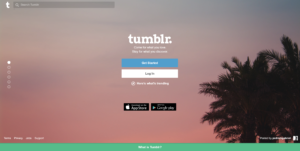
On sites with a lot of engagement, a lot of the traffic to a home page is from people who are already customers and want to login. In this case, your goal is to just make logging iin as easily as possible or auto-log them in via something like Google Smart Lock. Better yet, if you can make sure you never logout your customers, then they never see this page and get right back into the product. Facebook, Pinterest, and Tumblr are good examples of this.

While Facebook has sign up front and center, it has a top navigation bar for login, and that is where the cursor begins.

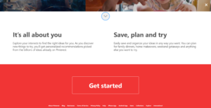
Pinterest has a unified sign up and login field with a friendly call to action that just says continue. It also has a dedicated Login button for those searching for it.

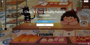
Tumblr has a login button front and center equal to the signup button.

The metric when you are optimizing for logins is login conversion rate. This may be harder to calculate than you think. Let’s do an example. Let’s say you have 10,000 people visit your home page. 2,000 login. Let’s say another 500 sign up on this page. Your login conversion rate is 2,000 / (10,000 – 500) = ~21%. You don’t actually know if the remaining 7,500 who did not login or sign up were there to sign up or login. If you have cookie data, you can check to see if they had ever logged in, and that may give a clue on how to segment them. If you don’t have that data, you assume they were there to login. If at all possible, you should never log people out. The best way to help them login is to keep them logged in. Tools like Google SmartLock are also effective.

Traffic Type #2: People who want to sign up
Someone coming to your home page directly is not doing so because they randomly type it into a browser. They already have some context. A friend told them about it, they read an article about, or something similar. Many of those people are already convinced and want to sign up, and the job of the home page is to get out of their way and make that as easy as possible. Generally, sites do this by putting a sign up form front and center, and making that form really easy to fill out. You can see how Facebook and Pinterest do this really well. If you look at the images above, Facebook’s signup formis right aligned, and Pinterest’s is front and center. There isn’t much to distract you from signing up.

The metric when you are optimizing for signups is signup conversion rate. It is similar to login conversion rate, just with signup as the numerator instead of logins, and logins are subtracted by the numerator. Given the same number from above, your signup conversion rate is 500 / (10,000 – 2,000) = ~6%. You still don’t actually know if the remaining 7,500 who did not login or sign up were there to sign up or login. So, to be conservative, you assume they were there to sign up.

Traffic Type #3: People who want to learn more
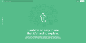
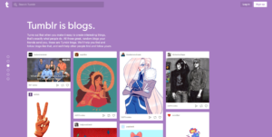
There can be a wide discrepancy between the people who come to your home page directly, and are not existing users. Some may want to sign up quickly like above, but others just want to learn more. Preferably, they would not like to have to give you their information before they understand if the site is for them. The ideal scenario for these these users is to see a free preview. If personal information is required to show a convincing product, then the home page sells the value instead of shows it, or asks for filtering criteria without asking for personal information. Tumblr, Pinterest, and Facebook all address this type of user in different ways. Facebook, as seen in the example above, left aligns the explanation of Facebook on the page. Pinterest and Tumblr create a separate call to action to learn more that triggers a dedicated “learn more” experience. Pinterst has a red call out with a How It Works button, and Tumblr has a clickable green bar at the bottom of the page asking “What is Tumblr?”. Both clicks result in scrolling explanations of what you can use these products for.
Tumblr:


Pinterest:

Traffic Type #4: People who are skeptical
There is a fourth type of new user that visits your home page. This is the person who heard about it, but is very skeptical. The best way to engage this user is to let them have free usage of the product for as long as possible. You usually encounter these users with very well penetrated products that are reaching the very late majority or laggards. Google is a good example of a site that lets you experience the product value without signing up.

You can see from the above examples that companies try to address multiples of these audiences at the same time on the page. In some cases, based on activity of the page, they will be able to bucket you into one of these groups definitively. Gibson Biddle has a great post on how Netflix evolved their design with regards to these different types of users and these users’ understanding of their brand over time.


As you’re working on your home page, you should first make sure it is the most important page to work. For many sites, their landing pages are where a lot more people get introduced to the product. When you do work on your home page, think about these four audiences, which one you really need to optimize for, and if you easily segment and address the other groups that are not your primary focus. Also, be sure to revisit thes decisions over time as audiences and brand awareness changes.

Currently listening to Mind Bokeh by Bibio.

Why Onboarding is the Most Crucial Part of Your Growth Strategy

When people talk about growth, they usually assume the discussion is about getting more people to your product. When we really dig into growth problems, we often see that enough people are actually coming to the products. The real growth problems start when people land… and leave. They don’t stick. This is an onboarding problem, and it’s often the biggest weakness for startups. It can also take the longest to make meaningful improvements when compared to other parts of the growth funnel.

In my role as Growth Advisor-in-Residence at Greylock, I talk to startups in the portfolio about getting new users to stick around. Through many failed experiments and long conversations poring over data and research, I have learned some fundamental truths about onboarding. I hope this can function as a guide for anyone tackling this problem at their company.

What is Successful Onboarding?
Before you can fix your onboarding efforts, you need to define what successful onboarding is to you. What does it mean to have someone habitually using your product? Only then can you measure how successful you are at onboarding them. To do so, you need to answer two questions:

  • What is your frequency target? (How often should we expect the user to receive value?)
  • What is your key action? (The action signifies the user is receiving enough value to remain engaged)

To benchmark frequency, look at offline analogs. At Grubhub, we determined how often people ordered delivery by calling restaurants. The answer was once or twice a month, so we used a “once a month” as a benchmark for normal frequency for Grubhub. At Pinterest, the analog was a little harder to determine, but using Pinterest was most like browsing a magazine, which people read weekly or monthly. So we started with monthly, and now they look at weekly metrics.

Identifying the key action can be easy or hard — it depends on your business. At Grubhub, it was pretty easy to determine. You only received value if you ordered food, so we looked at if you placed a second order. At Pinterest, this was a little harder to determine. People derive value from Pinterest in different ways, from browsing lots of images to saving images to clicking through to the source of content. Eventually, we settled on saving (pinning an image to your board), because, while people can get value from browsing or clicking through on something, we weren’t sure if it was satisfying. You only save things if you like them.

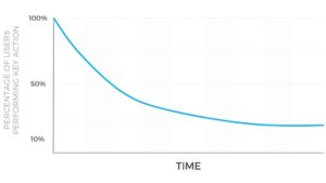
Once you know your key action and your frequency target, you have to track that target over time. You should be able to draw a line of all users who sign up during a specific period, and measure if they do the key action within the frequency target after signup. For products with product/market fit, the line flattens as a percentage of the users complete the key action every period:

If the line flattens rather quickly, your successful activation metric is people who are still doing [key action] at [set interval] at [this period after signup]. So, for Pinterest, that was weekly savers four weeks after signup. If your cohort takes a longer time to flatten, you measure a leading indicator. At Grubhub, the leading indicator was a second order within thirty days of first order.

How should you research onboarding?
You can break down cohort curve above into two sections. The part above where the curve flattens are people who “churn”, — or did not receive enough value to make the product a habit. The people below where the curve flattens have been successfully onboarded.

To research onboarding, talk to both groups of people to get their thoughts. I like to do a mix of surveys, phone calls, and qualitative research using the product. I usually start with phone calls to see what I can learn from churners and activators. Our partner Josh Elman talks about best practices to speaking with churners, or bouncebacks. If I am able to glean themes from those conversations, I can survey the broader group of churners and activators to quantify the reasons for success and failure to see which are most common. (Sidenote: You’ll need to incentivize both groups to share their thoughts with you. For those that didn’t successfully activate, give them something of value for their time, like an Amazon gift card or money. For those that did, you may be able to give them something free in your product.)

But it is not enough to just talk to people who already have activated or churned. You also want to watch the process as it’s happening to understand it deeper. In this case, at Pinterest, we brought in users and watched them sign up for the product and go through the initial experience. When we needed to learn about this internationally, we flew out to Brazil, France, Germany and other countries to watch people try to sign up for the product there. This was the most illuminating part of the research, because you see the struggle or success in real time and can probe it with questions. Seeing the friction of international users first hand allowed us to understand it deeper and focus our product efforts on removing that friction.

The principles of successful onboarding
#1: Get to product value as fast as possible — but not faster
A lot of companies have a “cold start problem” — that is, they start the user in an empty state where the product doesn’t work until the user does something. This frequently leaves users confused as to what to do. If we know a successful onboarding experience leads to the key action adopted at the target frequency, we can focus on best practices to maximize the number of people who reach that point.

The first principle we learned at Pinterest is that we should get people to the core product as fast as possible — but not faster. What that means is that you should only ask the user for the minimum amount of information you need to get them to the valuable experience. Grubhub needs to know your address. Pinterest needs to know what topics you care about so they can show you a full feed of ideas.

You should also reinforce this value outside the product. When we first started sending emails to new users at Pinterest, we sent them education on the features of Pinterest. When Trevor Pels took a deeper look at this area, he changed the emails to deliver on the value we promised in the first experience, instead of telling users what we thought was important about the product. This shift increased activation rates. And once the core value is reinforced, you can actually introduce more friction to deepen the value created. When web signups clicked on this content on their mobile devices, we asked them to get the app, and because they were now confident in the value, they did get the app. Conversely, sending an email asking users to get the app alone led to more unsubscribes than app downloads.
Many people will use this principle as a way to refute any attempts to add extra steps into the signup or onboarding process. This can be a mistake. If you make it clear to the user why you are asking them for a piece of information and why it will be valuable to them, you can actually increase activation rate because it increases confidence in the value to be delivered, and more actual value is delivered later on.

Principle #2: Remove all friction that distracts the user from experiencing product value
Retention is driven by a maniacal focus on the core product experience. That is more likely to mean reducing friction in the product than adding features to it. New users are not like existing users. They are trying to understand the basics of how to use a product and what to do next. You have built features for existing users that already understand the basics and now want more value. New users not only don’t need those yet; including them makes it harder to understand the basics. So, a key element of successful onboarding is removing everything but the basics of the product until those basics are understood. At Pinterest, this meant removing descriptions underneath Pins as well as who Pinned the item, because the core product value had to do with finding images you liked, and removing descriptions and social attribution allowed news users to see more images in the feed.

Principle #3: Don’t be afraid to educate contextually
There’s a quote popular in Silicon Valley that says if your design requires education, it’s a bad design. It sounds smart, but its actually dangerous. Product education frequently helps users understand how to get value out of a product and create long term engagement. While you should always be striving for a design that doesn’t need explanation, you should not be afraid to educate if it helps in this way.

There are right and wrong ways to educate users. The wrong way: show five or six screens when users open the app to explain how to do everything — or even worse, show a video. This is generally not very effective. The right way: contextually explain to the user what they could do next on the current screen. At Pinterest, when people landed on the home feed for the first time, we told them they could scroll to see more content. When they stopped, we told them they could click on content for a closer look. When they clicked on a piece of content, we told them they could save it or click through to the source of the content. All of it was only surfaced when it was contextually relevant.

Onboarding is both the most difficult and ultimately most rewarding part of the funnel to improve to increase a company’s growth. And it’s where most companies fall short. By focusing on your onboarding, you can delight users more often and be more confident exposing your product to more people. For more advice on onboarding, please read Scott Belsky’s excellent article on the first mile of product.

Currently listening to Easy Pieces by Latedeuster.

The Right Way to Involve a Qualitative Research Team

Most teams significantly under-invest in qualitative research. Growth teams especially are all about data, but they think that data can only come from experiments. This can make teams overly reliant on what they can learn from experiments and the quality of the data they have, and under-invest from what they can learn from talking to users. This problem is usually exacerbated by the fact that existing researchers at startups aren’t usually assigned directly to teams or work independently. I’ll talk about some of the problems I’ve seen, and the right way to invest in qualitative research for your growth team.

Learning and Applying from Research
Using the right type and method for your question is key. Of course, qualitative research is one component of the research stack along with quantitative research and market research. There is also different types of qualitative research depending on what you are trying to learn.

I remember when I was at Apartments.com and went to my first focus group, a common type of qualitative research. It was a mess for multiple reasons. The first reason was structure. Finding an apartment is not a large social behavior, so why were we talking with a group of ten strangers at once? As what I later learned usually happened, one or two participants volunteered the majority of the feedback, so while we paid for ten people’s opinions, we really only received two people’s opinions. So, I now only do research with multiple people in the room if it’s a social product, and it’s a group that would use it togethers e.g. friends or co-workers.

The second issue was delivering the feedback to people who weren’t there. I wrote up a long perspective on what the issues were with Apartments.com vs. our competitors. It primarily included product feedback on why we were getting crushed by Craigslist in major cities. I sent it to my VP and received a one sentence reply, “Don’t get ahead of yourself.” What a waste of time, I thought. We do all this research, generate real insights, and no one’s interested.

I’ve now learned that research teams inside companies feel this every day. At Pinterest, we had an amazing research team, but they were originally a functional team, which meant they had to determine their own roadmap of what to research. Depending on the stakeholders you listen to, this can be broad strategic projects like “What is the deal with men?” to specific projects like “Help us test this new search flow already built.” Research can add value at both stages, so the team worked on both.

What I think research found when they worked on the broader strategic issues was similar to my response at Apartments.com. “Cool, but not my roadmap!” say the product managers. Research then gets filed away never to be looked at again. Researchers get very frustrated. To be clear, this is a failure of leadership — not the product teams — if these areas aren’t prioritized. But it is common. On the flipside of working on something already built, success was more variable based on how well the product team defined what they wanted to learn. Frequently, what the product team wanted to learn was that they could ship it, so they selectively listened to feedback to things that indicated they were on the right path.

What I have learned suggests that qualitative research cannot be effective unless 1) its people are dedicated a cross-functional product team and 2) research is involved throughout the entire product development process, from initial research on market to determining a strategy to testing concepts to testing nearly finished products. The value of research accrues the more it is a part of each step in the process.

This approach solves for two main problems. One is that product teams will only pay attention to feedback that is directly related to their current product and on their own timeline. Without being part of the cross-functional team that includes product, engineering, and design, it is hard for research to to be on the same timeline. The second problem this solves is it helps research prevent the rest of the team from locking on assumptions that they may be wrong, so they are focused on the right solution to the problem with research, instead of confirmation bias at the end of a project. The Pinterest team has moved to this model, and for my teams, it made both sides much more successful.

When to Research and When to Experiment
For teams that rely too much on experiments and not enough on research, I tell them two things:

  • Experiments are great for understanding what people do and don’t do. Research helps you understand why they do or do not do those things
  • Experiments don’t help you understand the under-represented groups that might be the most important to learn from e.g. non-users or smaller segments of users

A great way to get started with research as a team is to answer why your experiment didn’t work. Sometimes, the answer is there in the experiment data, but frequently it is not. You have to talk to users to understand why they are doing what they are doing. The best way to do that is to ask them the context of them doing or not doing it.

There is also the middle ground of quantitative research that can be helpful (usually surveys). What I usually like to do is use qualitative research to understand the universe of reasons for something, and use quantitative research if I need to quantify the importance/commonality of those reasons.

Research also helps you isolate users you may not be able to isolate with your usage data. For example, at Grubhub, we were trying to understand how many people used Grubhub regularly for delivery, but not for every order. So, we asked. Then, we called those users to understand why they sometimes don’t use Grubhub, then sent another survey with those reasons to quantify which ones were most important to address. I outline that process more here.

But I Don’t Even Have a Research Team
At Grubhub, we didn’t have a research team for the first couple of years (or even a product team for that matter). So, when we needed to learn things, me, someone on my team, or our sole designer (hello Jack!) would do one of three things: 1) throw flows up on usertesting.com, 2) survey users on our email list, or 3) call users on the phone, and provide them with free food for their time.

You don’t need to be a professional researcher to do this, though they are better at it. You just need to determine what you’re trying to learn and who from. You want to watch people go through that situation if you can. If you can’t, ask them about the last time it happened and what they did and why. You will get better at it the more times you do it. Startups are starting to hire researchers earlier in their development because of the importance of understanding users beyond the data. So, you may be able to justify a full time role here earlier than you thought.

Thanks to Gabe Trionfi for reading early drafts of this and providing his feedback. HeHAH!

Currently listening to Beyond Serious by Bibio.

Three Mistakes Integrating Growth and Design Teams and How to Address Them

While I encourage growth teams to start with a dedicated designer, that doesn’t usually happen. Usually, growth teams scale with just engineering and product, and as they scale to a certain size start to eventually “earn” a dedicated designer from the organization. This news makes growth teams extremely happy for a short period of time, but pretty quickly starts to create problems and culture clash. I’ll talk about what happens, and some ways I’ve found to solve these issues. Note: You can replace growth with marketing, and just about the same thing happens in these scenarios.


When you hear you’re getting a dedicated designer, you’re happier than Jim Carrey was back when he had a career.

Problem #1: Team Control AKA The Two Scenarios
One of two scenarios usually emerges when designers join a growth team. In the first scenario, the engineers or PM or marketing person starts with, “I’m so glad you’re here. I need this done and this done and this done for an experiment…tomorrow. No, we don’t need research to understand the problem. Don’t worry. I’ll only ship it if the metrics increase.” The designer realizes the growth team didn’t want a designer. They wanted a pixel monkey to just do what they say, not ever use their brain.


I got 99 problems, but a designer using their brain ain’t one.

The other scenario is just as bad. In this scenario, I call it the designers “moving in”. I liken this to the scenario when a significant other moves into your place and brings way more things than you own to move in. “Don’t worry, I got better furniture and books, and, oh, we’re going to have to get rid of those curtains.”

The design version of this is something like “I’m going to completely rethink all our strategies. I need to spend three months just doing research and then at least double that for design concepts. That home page really needs to change though.” Engineering thinks “this isn’t what we need. These people don’t even know what they’re talking about.” Engineering gets kicked out of the process of figuring out what to work on, and since the design process has no deadlines on it, engineering begins to have nothing to work on.


I tried to find a picture of people dressed in all black moving in, but the best I could do was chambray.

In both scenarios, instead of designers, engineers, product managers, and marketers trying to unify to form one team that leverages all of their strengths, one team tries to dominate the direction. What we did at Pinterest to try to solve this problem was design a process where the teams, specifically design and engineering, are jointly responsible for problem definition and solutions. Here’s what it looks like:

Project Kickoff:
Attendees: PM (leader), engineering lead, design lead, engineer and designer that will be working on the project

Goals:

  • Define the problem we’re trying to solve
  • Any existing ideas on how we might solve it
  • Any previous attempts to solve the problem
  • What metrics we need to inform potential solutions
  • How will we tell if we’re successful

Output:

  • Notes emailed to broader sub-team
  • Slack channel created just for the project, which includes notes and all future communication for the project

Project Brainstorming:
Attendees: engineer and designer on the project, PM (optional so as to prevent their calendar from being a bottleneck)

Goals:

  • Produce multiple potential solutions to the defined problem
  • Prepare those for feedback from attendees of kickoff
  • Cover additional measurement needed for directions that have been chosen e.g. how many people click top right login button

Brainstorm Review:
Attendees: PM, engineering lead, design lead, engineer and designer working on the project (leaders)

Goals:

  • Feedback on concepts from brainstorm
  • Choose one or two directions for experiment

Experiment Launch:
Attendees: engineer and designer working on the project (leaders), PM

Output:

  • Experiment doc that team agrees reflects what we’re testing and why
  • QA and approval over Slack from every team member that experiment is ready to launch to 1%
  • Note: Ramp ups of experiment communicated in Slack channel

Experiment Review:
Attendees: PM (facilitator), engineering lead, design lead, engineer and designer that worked on the project (leaders)

Goals:

  • Determine if you gathered data on key questions you needed to answer for the experiment
  • If yes, what does the data say?
  • If not, how do we get the data?

Output:

  • Ship/kill/iterate decision
  • Emailed notes to the entire team of what happened and why
  • Updated experiment doc on what happened
  • Updated Slack channel
  • Designer brings ship experiment candidates to design manager/lead for any feedback before shipping
    • Problem #2: Design Best Practices
      Designers bring with them a history of best practices from working on other design teams and schooling/training. It can be a culture shock for a designer joining a growth team and seeing little of these being followed. Designers will usually respond to this environment by trying to educate on many things the growth team is managing are designed “wrong” and how they need to be changed. These recommendations based on best practices are usually rejected by engineers on the team as it contradicts what they’ve seen in the data.


      A growth engineer after he hears about a marketing or design best practice.

      Design best practices were created with good purpose, but they quickly become inferior to AB testing in an environment where a direction can be put in front of users and its value quantitatively determined in days or weeks. This doesn’t mean you should AB test every design decision, but it does mean a designer can’t put their foot down by saying something is a best practice. In growth, the users being tested on determine what’s best.

      Another issue with design best practices being applied to growth is that design best practices are usually suited entirely for building user value only. The growth team in many cases needs to trade off user value and business value, or short term user value vs. long term user value. For example, someone can come to my site, and I can offer a great experience. The user then leaves and never comes back. Growth might decide to let someone get a preview of that experience, then ask the user to sign up so they can personalize and deliver more value. The result is that some people will not sign up (creating a worse user experience) and some will sign up, allowing the site to create a better user experience that day and over the long term. This accrues value for the business as well.

      Designers usually feel threatened by this environment initially. They see testing as a threat to their expertise. What you have to do is teach them to use it as a tool to get closer to user feedback at scale and be more efficient with their time. Most design work is wasted because it is spent on a direction that later proves to be flawed. With AB testing, a design can get quick feedback on an idea, validate the direction, then spend the time making it amazing once they know it’s worth that effort.

      That said, while this user feedback at scale is good at showing what users do, it’s not great at explaining why. So, along with spending time getting designers comfortable with testing, growth teams need to start doing more regular qualitative research as well. Designers will usually volunteer to do it themselves if there isn’t the right person to staff for it. Some PM’s are comfortable doing it as well. Engineers and engineering managers can be resistant to spending time watching the sessions, so the first couple you schedule have to be on critical areas you feel there is some understanding the team is missing by only looking at the metrics.

      Once designers get a little more seasoned on growth, you should also work with them to create the new best practices for growth to make the design and engineering process move faster. They will look very different than what designers recommended at the beginning, and be backed by data. Along with this process, I think it’s important to start creating user experience goals for your growth team at this time. These will be components that may not affect the metrics, but ensure a quality and consistent user experience. At Pinterest, we made compliance to design spec a requirement to ship after an experiment is validated, and said our top five flows had to be completely audited for quality user experience. This is a worthy compromise with design to show you actually care about the users and not just the business, a common complaint.

      Problem #3: Growth Onboarding
      Sometimes, you want to make sure you just nail the basics. Most growth designers are joining a new team in a discipline they’ve never worked on before, yet they don’t receive any onboarding as to what growth is and why it’s different. This is also an issue with other new growth team members. It’s like being dropped into a foreign country, not knowing the language, having no one help you, and being expected to contribute to the culture. Like France (okay, I’ve actually been to France, and the people were surprisingly welcoming even though they’re not known for being so). What happens is designers get frustrated and churn from the team.

      It’s critical that every new team member, especially designers, go through a growth team onboarding process. The first thing you do is state the purpose for your growth team, why it’s different from other product teams, and why it’s important. At Pinterest, I would say that while other product teams create value or improve the value of the product, growth teams focus on connecting people to the current value of the product and reducing the friction that prevents that connection. This is important because it’s not enough to build a good product. If no one knows about it, it will die. If it’s too hard to uncover its value, it will also die.

      What we did at Pinterest was create a history of major growth projects that were successful, walked through them, and explained why they were successful. That led into some of our team principles. We also spent a lot of time educating new people on the metrics we use and why. You can’t be expected to design winning experiences if you don’t understand the major criterion for success we’ll be using.

      After onboarding, instead of starting designers on large, complicated projects, it’s important to start them on a well scoped, smaller project, preferably with an experienced PM and engineer, hopefully patient ones. These should still be projects that are worth doing, but not large projects. We had a designer start on growth at Pinterest, and we immediately put her on one of the most strategic, long term investments for the team. While she did great work there, after a few months, she did a smaller side project redesigning our mobile web home page. The conversion rate increased, and we shipped it. She said, “Guys, this is the first time my design increased the metrics!” She was beaming. You want to get new growth designers to that moment as soon as possible.

      Lastly, once onboarded, you want designers contributing growth ideas as soon as possible. I like the idea of forcing people to bring one new idea to the team per week. I believe this is a muscle that needs to be developed via practice. New entrants to the team (design or otherwise) will typically propose bad ideas for a while. That’s okay. The trick is to provide a framework for generating ideas that makes new team members think about elements that typically make for good growth ideas, give feedback on the ideas submitted, and have the ideas be submitted as metrics wins or user experience wins. The Pinterest template focused on :

      • How many people would see this experience if it were built? This is usually by far the most important criterion for a successful growth idea. Any experience has to be seen by a lot of people to have a big possible impact on the business.
      • Has the company tried something in this area before? If so what were the results? This helps us make sure we use any previous learnings to avoid making the same mistakes. Just because we tried something before doesn’t mean it’s a bad idea though as growth environments change frequently.
      • How much effort is required for this idea? On growth, we also try to do the least amount of work to validate an idea is worth it.

      There is no reason designers can’t be key contributors to a growth team, but expecting it to happen automatically is usually a recipe for failure. I hope some of these tips can help you create a thriving cross-functional growth team with all the right disciplines involved. If you’ve have any other issues integrating design into your team, I’d love to hear about them in the comments.

      Currently listening to Sorry I Make You Lush by Wagon Christ.

The Perils and Benefits of AB Testing

Bob, our head of product design at Pinterest, asked me to write up a post on the perils and benefits of AB testing after reading my post on building cross-functional teams. This is me obliging.

One thing it is never difficult to do is to convince an engineer to do an experiment. In general, this is a good thing. Famous engineer W. Edwards Deming said, “In God we trust, all others bring data.” AB experiments generate data, and data settles arguments. AB experiments have helped us move from product decisions made by HIPPO (highest paid person’s opinion) to those made by effectiveness. We build better products as a result that delight more people.

An AB experiment culture can also have a dark side though. Once people figure out that AB experiments can settle disputes where multiple viewpoints are valid, that fact can lead people to not make any decisions at all and test everything. I liken this type of approach to being in a dark room and feeling around for a door. If you blindly experiment, you might find the way out. But turning the light on would make it way easier. Rabid AB testing can be an excuse for not searching for those light bulbs. It can be thought of as easier to experiment than to actually talk to your users or develop a strategy or vision for a product. Here are some perils and benefits of AB testing to think about as you experiment in your organization.

Benefits
1) Quantifying Impact
This one is pretty obvious. AB experiments tell you exactly what the lift or decrease a treatment causes versus a control. So, you can always answer the question of what an investment in Project X did for the company.

2) Limiting Effort on Bad Ideas
Another great benefit of AB testing is that you can receive feedback on an idea before committing a ton of effort into it. Not sure if an investment in a new project is worth it from a design and engineering perspective? Whip up a quick prototype and put it in front of people. If they don’t like it, then you didn’t waste a lot of time on it.

3) Limiting Negative Impact of Projects
Most additions to a product hurt performance. AB testing allows you to test on only a segment of an audience and receive feedback without it affecting all users. Obviously, the larger the company, the smaller the percentage you can trigger an experiment on to get a solid read.

4) Learning What Makes Something Work
In AB experiments, you isolate one variable at a time, so you know exactly what causes a change in metrics. You don’t have to debate about whether it was a headline or background color or the logo size anymore.

Perils
1) Not Building a Strategy or Vision
Many places convince themselves that testing is a strategy in and of itself. While AB testing can inform a strategy or vision, it is not one in and of itself. What happens in these cases is that companies do tons of random experiments in totally different directions, and their failure rate is very high because they have no unifying vision on what they are trying to do.

2) Wasting Time
AB testing can slow companies down when they convince themselves that every single thing needs to be tested thoroughly. Everyone knows of the anecdote from Google where they tested 41 shades of blue.

3) Optimizing for the Wrong Metric
AB experiments are designed to measure the impact of a change on a metric. If you don’t pick the right metric or do not evaluate all of the important ones, you can be making tradeoffs in your product you do not realize. For example, revenue over user engagement.

4) Hitting A Local Maxima
AB experiments do a very good job at helping optimize a design. They do not do as well as helping to identify bold new designs that may one day beat current designs. This leads many companies to stay stuck in a design rut where their current experience is so well optimized, they can’t change anything. You need to be able to challenge assumptions and invest in a new designs that may need quite a bit of time to beat control. This is why most travels sites look like they were last re-designed in 2003.

So, I’d prefer to optimize Deming’s quote to “When the goal is quantified and the ROI is worth it, run an AB experiment. All others bring vision.” It doesn’t have quite the same ring to it.

Currently listening to Forsyth Gardens by Prefuse 73.

Failover Fails


One of my favorite quotes is from Mitch Hedberg:

An escalator can never break — it can only become stairs. You would never see an “Escalator Temporarily Out Of Order” sign, just “Escalator Temporarily Stairs. Sorry for the convenience”. We apologize for the fact that you can still get up there.

I’m reminded of this quote whenever I travel because so many apps on my phone don’t fail over this gracefully. My favorite historically have been foursquare’s. Whenever it couldn’t tell where I was, it would say “A surprising new error has occured.” or “must provide il or bounds”. Let’s forget for a second that these are the most unhelpful error messages ever and get to the bigger problem. foursquare (and most other apps) are designed only for a fully connected, localized experience. This is in a world where, even in cities, 4G connections can be intermittent, and GPS quality is sketchy at best, especially inside. Apps break all the time because of these issues, and it’s not excusable.

As we move towards always in the cloud, total internet and GPS reliant services, software makers need to think about these alternate states and design better experiences for them. It will be a long time before a wireless connection is reliable anywhere in the US, let alone internationally. It will be a while before GPS tracking works well in many places. Connections may be slow. Batteries may be low. Available storage my be low. I like to think of it like testing for different browsers and devices. If you aren’t testing for different connection states or with/without certain pieces of key information, you’re not testing right.